

by Rachel Cabitt
From Drafting Table Vol. 1, No.1
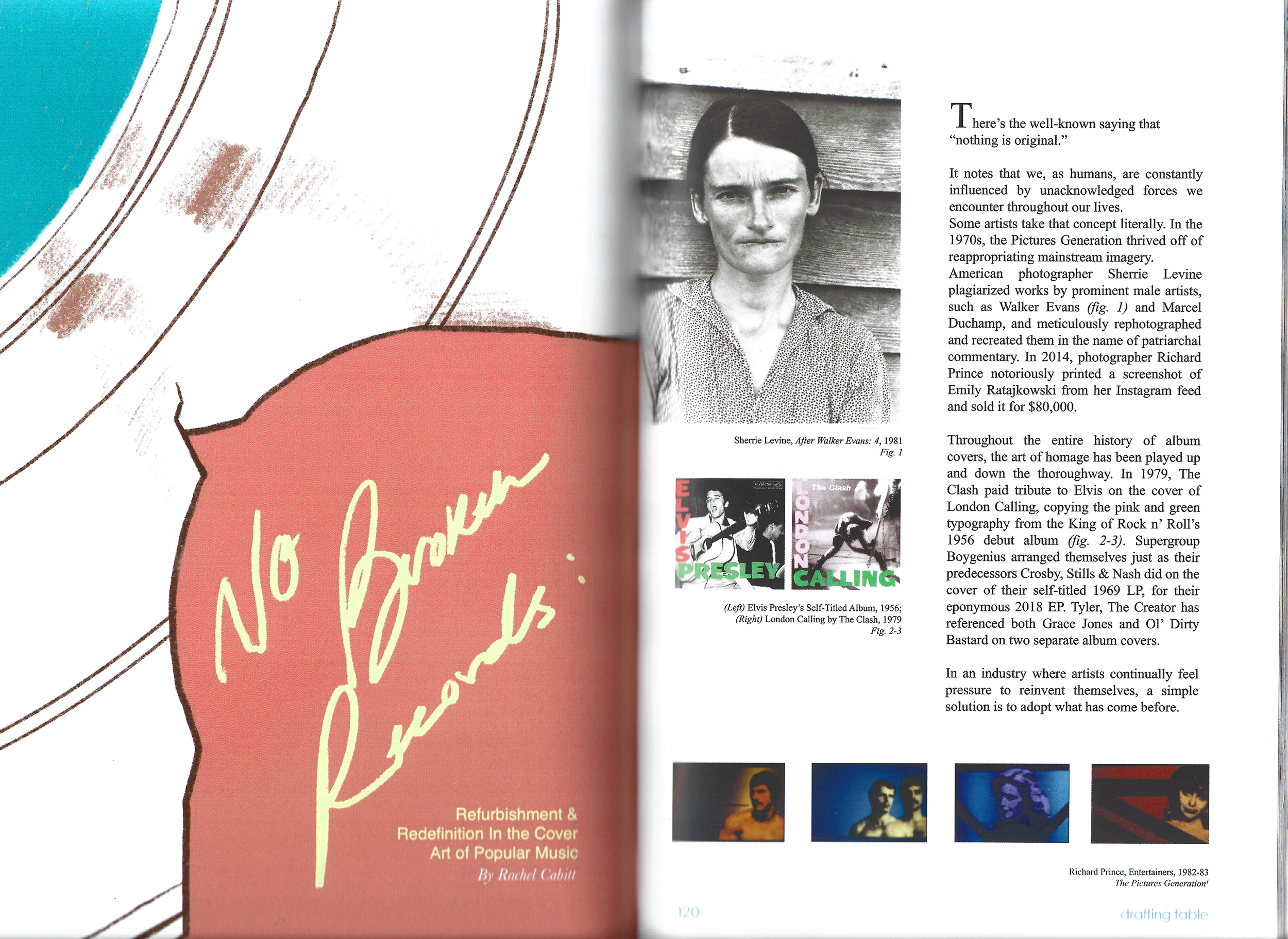
There’s the well-known saying that “nothing is original.”
It notes that we, as humans, are constantly influenced by unacknowledged forces we encounter throughout our lives.
Some artists take that concept literally. In the 1970s, the Pictures Generation thrived off of reappropriating mainstream imagery. American photographer Sherrie Levine plagiarized works by prominent male artists, such as Walker Evans (fig. 1) and Marcel Duchamp, and meticulously rephotographed and recreated them in the name of patriarchal commentary. In 2014, photographer Richard Prince notoriously printed a screenshot of Emily Ratajkowski from her Instagram feed and sold it for $80,000.
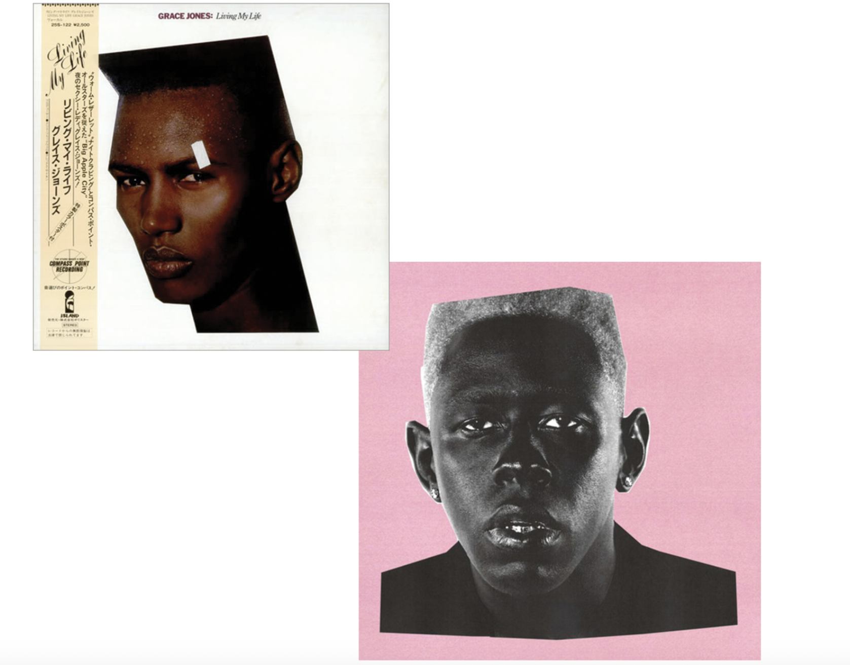
Throughout the entire history of album covers, the art of homage has been played up and down the thoroughfare. In 1979, The Clash paid tribute to Elvis on the cover of London Calling, copying the pink and green typography from the King of Rock n’ Roll’s 1956 debut album (fig. 2-3). Supergroup Boygenius arranged themselves just as their predecessors Crosby, Stills & Nash did on the cover of their self-titled 1969 LP, for their eponymous 2018 EP. Tyler, The Creator has referenced both Grace Jones and Ol’ Dirty Bastard on two separate album covers. In an industry where artists continually feel pressure to reinvent themselves, a simple solution is to adopt what has come before.
As a designer and photographer who makes album covers for a living, I’m keenly aware that adopting an idea can be the first step of the creative process. The next step, however, should always be to redefine the concept to fit the record’s story. Once, during a brainstorming session over coffee, a client passingly mentioned they wanted their album cover to be so iconic that fans would dress up as them for Halloween. Think David Bowie’s lightning bolt Aladdin Sane.
I’m similarly a firm believer that cultural moments later deemed iconic were never made with the intention of hitting that goalpost. Art that breaks through often emanates from a desire to relinquish the status quo. The work is made as an experiment to free the maker.
In July 2024, Florida-born rapper Doechii took the reins and announced to her label that she would be releasing her second mixtape, Alligator Bites Never Heal, within a month. Speaking to Rolling Stone, she stated, “It was out of this new place of clarity and sobriety. I was coming out of a very, very dark place in my career and within myself” –
covering everything from depression and the growing pains of viral fame, to clashes with her label, her therapeutic honesty went on to win her Best Rap Album at The GRAMMYs that year.
In July 2024, Florida-born rapper Doechii took the reins and announced to her label that she would be releasing her second mixtape, Alligator Bites Never Heal, within a month. Speaking to Rolling Stone, she stated, “It was out of this new place of clarity and sobriety. I was coming out of a very, very dark place in my career and within myself” – covering everything from depression and the growing pains of viral fame, to clashes with her label, her therapeutic honesty went on to win her Best Rap Album at The GRAMMYs that year.
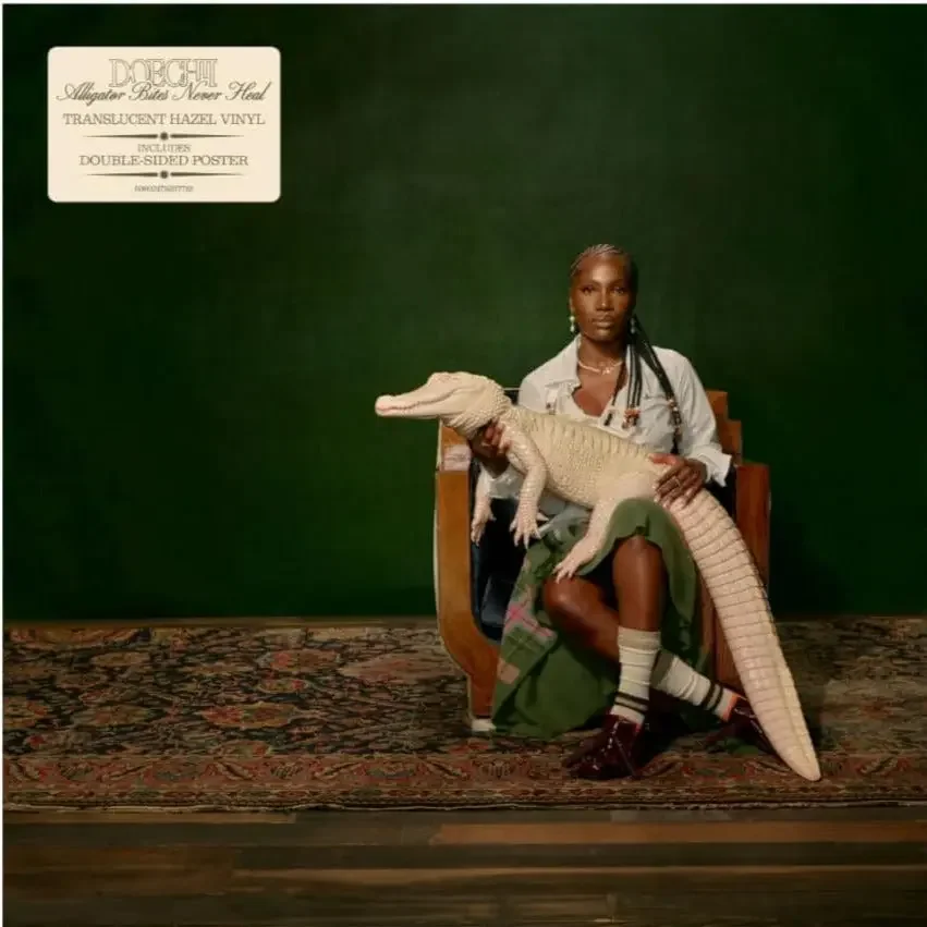
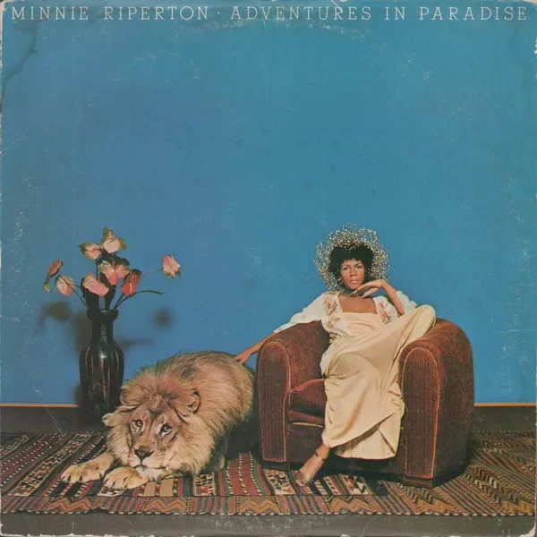
The album cover for Alligator Bites Never Heal depicts the artist sitting in a wooden chair, holding a white alligator and staring stoically into the camera. The image is an ode to Minnie Riperton’s 1975 record, Adventures In Paradise, in which the singer sits next to a lion on the cover. The similarities between the two images appear in the smallest details: a single chair atop a patterned rug, set against a plain expanse of colored wall. While there isn’t much documentation as to why a lion appears on Adventures in Paradise, Riperton’s regalness is unmistakably noted in her flower crown and choice to pose next to the king of the animal kingdom. Doechii, who often refers to herself as the Swamp Princess, saw the opportunity to visualize herself within the framework Riperton had provided. Swapping the lion for the alligator ties the Floridian back to her roots and gives the image a new life fifty years later. That same Summer, British hyperpop artist Charli XCX yearned to step away from her own image. She had no desire to adopt; only the need to redefine everything for herself. Up until her eighth album, BRAT, Charli had achieved relative success. Crash, her last record on the contract she signed at 16, earned the singer her first #1 album on the UK charts. But according to the BBC, it was “billed as a ‘sell-out’ adventure into commercial pop. The idea, she said, was to challenge herself after years of working on the experimental fringes of the top 40.” In an interview with Apple Music’s Zane Lowe, Charli declared that for once, the record label “left her alone” to do whatever she pleased while making BRAT.
She was allowed to be herself, producing an effortlessness not found on previous records. Lowe wholeheartedly agreed. He recalls that after their last interview in 2022, post Crash, he equally felt this to be an end of an era for the singer. “There was a release that day through the music of ‘I’m sick of trying to compromise here and there and be in a label matrix… It felt like you had had enough of that.” Charli nodded, explaining her thought process: Crash was for the record label, and “this next one [BRAT] is for me.”
BRAT was announced to the world in four lowercase pixelated letters against a wash of lime green. No image of the popstar in sight. The original idea for the text-based album cover originated from Charli comically trying to save money, thinking the record wouldn’t amount to much. In an interview with Apple Music’s Zane Lowe post BRAT, Charli declared that for once, the record label “left her alone” to do whatever she pleased. She was allowed to be herself, producing an effortlessness not found on previous records. This compounding of efforts to do the opposite of everything the artist had ever done resulted in a viral aesthetic that paraded itself around the internet as heat wave advisories, train updates, endless memes, and even banners for presidential candidates.
The relinquishment of control by others allowed BRAT to redefine what an album cover can be and resulted in millions adopting it for their own expression. But now that Charli had reached a pinnacle, many asked how the singer could ever top it. Around the one-year anniversary of BRAT, the cover on streaming services began disintegrating. At first, a scribble appeared, scratching out the title; then dirty rust seeped into the frame. At the end of her 2025 Glastonbury set, audiences saw Charli literally burn down the album cover that served as the stage backdrop. She was wiping the slate clean in order to redefine herself next, whenever that would be.
Less than a year later, rumors of a new “rock” album began circulating thanks to British Vogue printing the chorus to her lead single in her May 2026 cover story: “I think the dance floor is dead, so now we're making rock music.” The internet went mental. Charli really was redefining herself, going where she had never ventured before. Yet, when she released “Rock Music” as a double single on 7” a month later, the cover art was text-based, again.
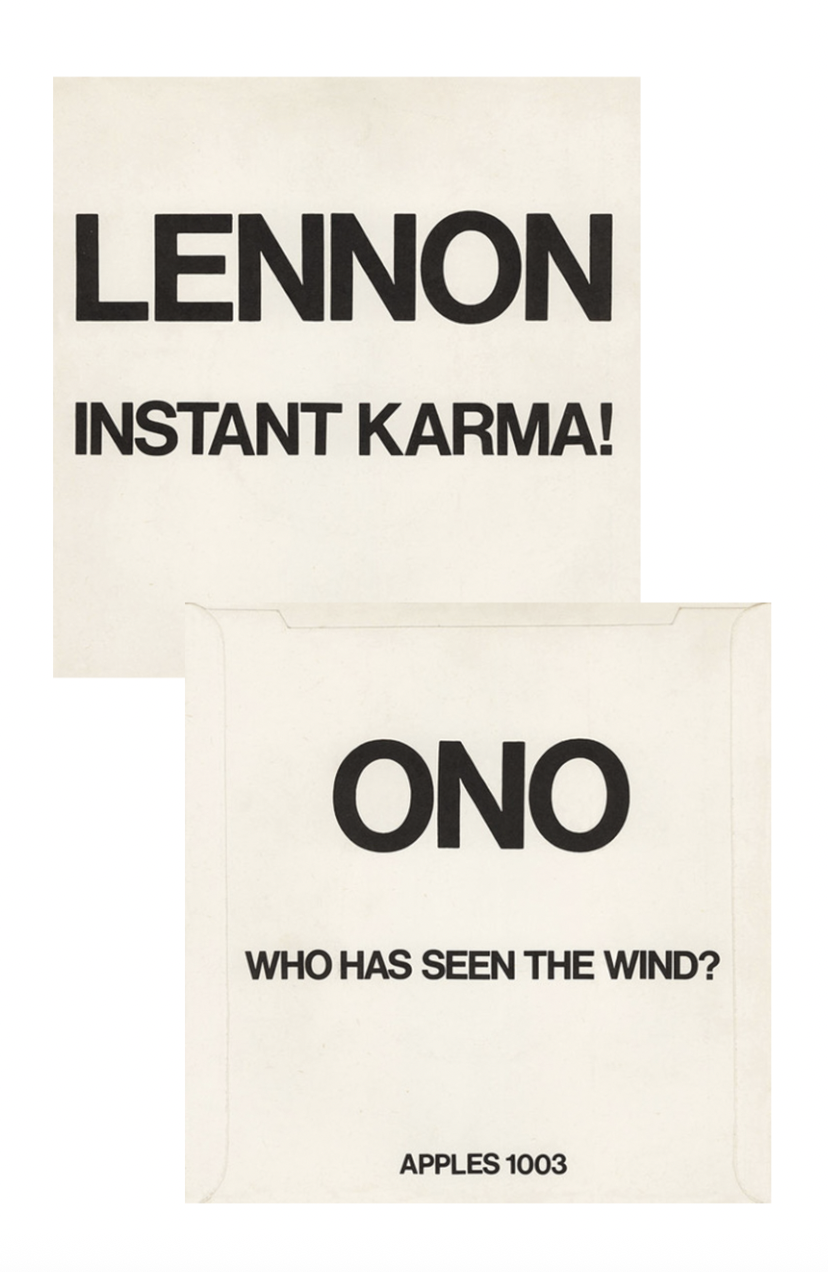
Laid out in a serif type and pasted against an off-white canvas, the artwork almost acts as BRAT’s alter ego. Yet upon closer inspection, also references early 7" plain promo sleeves. Utilitarian in design, these sleeves from the 1960s-80s simply included the artist name and song titles in non-descript text to function as clear, legible signs for DJs to easily play live on air and in clubs. Charli was making a rock album her way, but coating it in the original fashion of the genre. Then, she unveiled the cover for her ninth album Music, Fashion, Film: a black-and-white group portrait of industry titans John Cale (music), Marc Jacobs (fashion) and Martin Scorsese (film) all sitting in one room together. The very bare-bones nature of the single covers suddenly struck a very delightful note; she had adopted to reinvent in the shadow of already monumentally redefining her career.

Rachel Cabitt is an author, photographer, designer, and art director who co-founded POND Creative. She publishes The Art of Cover Art, a newsletter on the art history of album covers, and writes for It’s Nice That, Wallpaper*, AIGA Eye on Design, and many other outlets.